A tipping-bucket rain gauge does one thing: it counts. A small seesaw bucket fills, tips, empties, and the counter adds one. Every tip is converted to a millimetre value using the per-tip volume the gauge is calibrated to, a figure set per installation and never published as a fixed spec, because gauges and their calibration differ. Add up the tips over a day and you get a daily total, the number every farmer already knows how to read: 12 mm, 40 mm, 60 mm. What that total throws away, by design, is when the tips happened. Sixty tips spread across 24 hours and sixty tips inside one hour produce the identical daily figure and completely different consequences on the ground. That gap is what rainfall intensity measures, and it is not a vague idea, it is a rate with a defined denominator. Every step in computing it carries a number that changes what the final figure means, and this piece works through those steps one at a time.
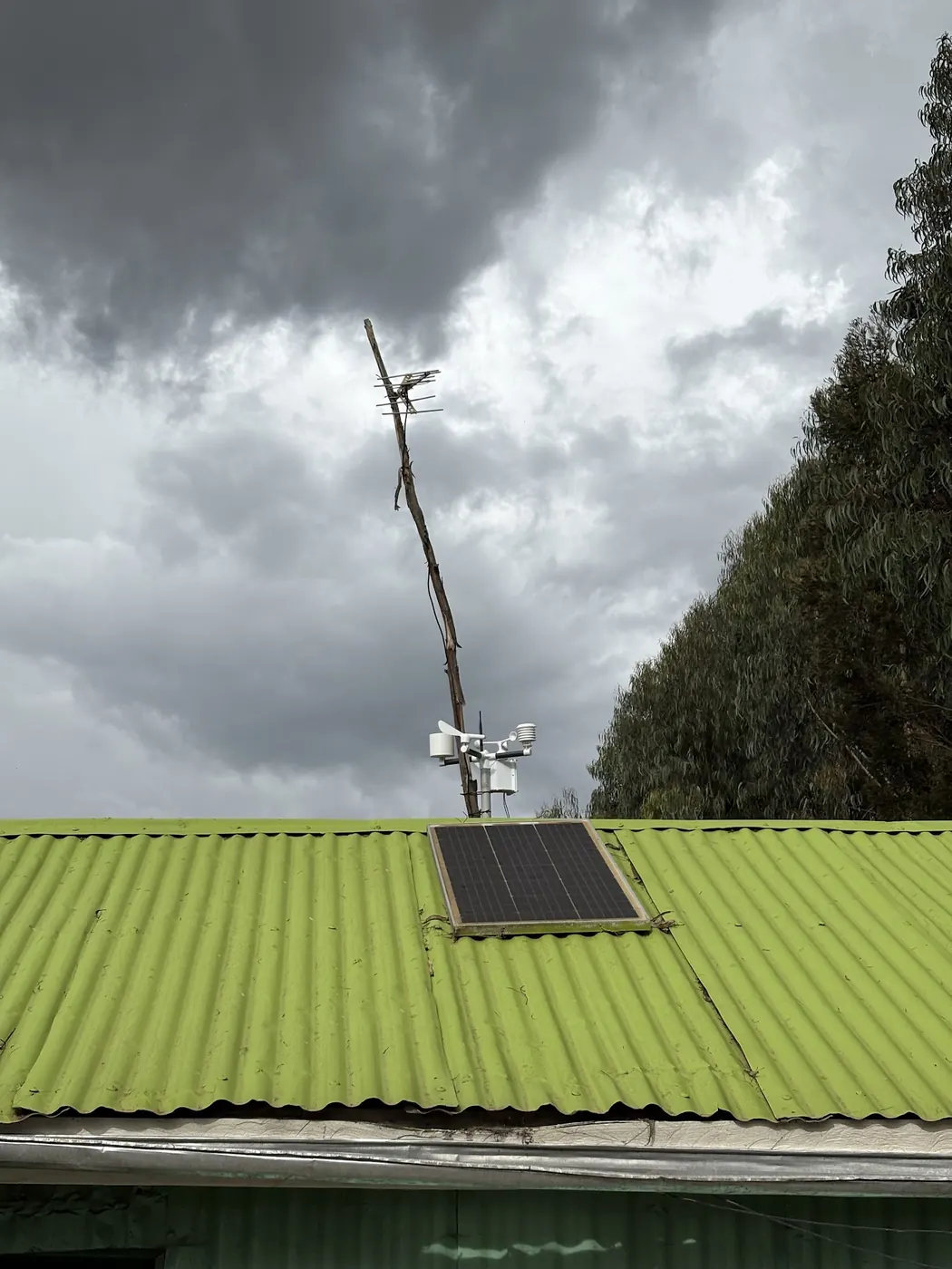
Measured by NuaSense weather stations and soil probes on Kenyan farms, over the period stated with each figure. Past readings, not a forecast.
Intensity is a rate, not a total
Intensity is depth divided by time: millimetres per hour, or per ten minutes, or per whatever interval you choose. The Texas Department of Transportation's rainfall intensity guidance defines it as the average rate for a specific duration and a selected return frequency, with duration set equal to what engineers call the time of concentration, roughly the time water takes to travel across a catchment. As duration shrinks toward zero, computed intensity climbs toward an unrealistic spike, so that guidance sets a floor: a minimum time of concentration of ten minutes, purely to stop the arithmetic producing nonsense as duration approaches zero. That floor is not a fact about rain, it is a fact about the equation. Any short-duration figure you encounter, ours or anyone else's, was computed against a chosen interval, and shifting that interval shifts the number without changing what fell from the sky. This matters practically because a farm manager comparing
Duration is baked into the definition, not added afterward
Engineering hydrology formalises this as an Intensity Duration Frequency curve, usually written IDF. The PMC-hosted study that built IDF curves for Addis Ababa, Dar es Salaam and Douala defines the curve as the maximum rainfall intensity for a given duration and a given return period, used directly to size flood protection structures. Three numbers sit inside every point on that curve: intensity itself, the duration it was measured or estimated over, and the return period, meaning how rare an event of that intensity and duration is expected to be. Change any one of the three and you describe a different event. A 60 mm-per-hour figure at a ten-year return period is not comparable to a 60 mm-per-day figure at the same return period, because the physical process, the rate water is arriving at the ground, is not the same process at all. A farm manager sizing a drainage channel or judging erosion risk needs to know which of the three numbers is fixed and which is being solved for, because reports sometimes quote one without the other two attached.
Somebody has to choose a statistical shape for the tail
Building an IDF curve means fitting a distribution to a set of extreme values, because the goal is describing events rarer than the record is long. The Addis Ababa, Dar es Salaam and Douala study used the Gumbel distribution, also called Maximum Extreme Value Type 1, to fit that tail. That choice is not universal: other regional studies use different distributions for the same job, and the New York projected curves used a regionalised L-moments approach fitting a generalised extreme value distribution for its return period thresholds. What matters for a Kenyan reader is not which distribution is correct in the abstract, it is that the choice is a modelling decision layered on top of raw counts, and two curves built from the same rainfall record with two different distributions will not agree exactly at the far tail, which is exactly where flood design and erosion risk live. A curve quoted without naming its fitted distribution is missing a variable that changes the answer at high return periods, even though it rarely moves the answer at common, everyday rainfall rates.
Where the sub-daily numbers actually come from
Here is the step that matters most for anyone reading rainfall data in East Africa. Addis Ababa, Dar es Salaam and Douala only had daily rainfall records to work with. Sub-daily intensities at 10 minutes, 30 minutes, one hour, three, six and twelve hours were not measured directly, they were generated from daily totals using a disaggregation model. That is an honest and standard technique, but it means the sub-daily figures in that paper are modelled estimates built on top of daily gauge counts, not readings from a sub-daily gauge. No comparable published curve exists for a Kenyan station in the material available here. If you want an intensity-duration-frequency curve for a specific Kenyan farm, the transfer is not to borrow the Addis Ababa numbers and relabel them, it is to recognise you face the same starting problem those researchers faced: whatever record you have is probably daily, and turning it into a sub-daily estimate requires the same disaggregation step, done against your own record, not someone else's city.
What a canopy actually intercepts depends on the burst, not the total
Move from engineering to biology and the same duration-versus-total distinction reappears. A study of two desert shrub species at Shapotou station in the Tengger Desert, China, recorded 210 rain events across 2004 to 2014 and found relative interception losses of 29.1 percent for Caragana korshinskii and 17.1 percent for Artemisia ordosica. The Nature Scientific Reports paper on shrub throughfall and interception ranked the variables explaining those losses in order of importance: gross rainfall amount first, then maximum rainfall intensity during any 60-minute window within the event, then rainfall duration, then the length of rainless gaps inside the storm. Intensity outranked duration. A storm that dumps its water in one aggressive burst wets the canopy, saturates its storage capacity, and lets the rest run to the ground as throughfall faster than the same total spread evenly across the same event. Rainless gaps inside a storm let a wet canopy partially dry and rebuild storage capacity, increasing total interception, a mechanism a daily total cannot show at all.
Related reading on this site: rain gauges.
The 60-minute window specifically, and why erosion studies keep returning to it
That same Nature paper cites earlier work by Dunkerley arguing that the actual bursts of rain within an hour carry more hydrological and erosive information than the hourly mean intensity, and that maximum 10-minute and 30-minute intensities, written I10 and I30, have shown greater explanatory power for soil erosion than mean intensity across multiple studies. The mechanism is intuitive once stated: soil detachment by raindrop impact and by sheet flow both scale with the peak rate water arrives at, not an average over an hour that includes lulls. A storm averaging 20 mm per hour but delivering half its water in a six-minute burst behaves, for erosion purposes, closer to a storm rated at the burst intensity than one rated at the hourly average. This is why both engineering IDF curves and erosion research keep breaking duration down into shorter windows: an average hides exactly the value doing the damage, and a farm reading only a daily total has no way to see it at all.
East Africa's short rains carry their own multiplier
Kenya Meteorological Department's State of the Climate report for 2022 notes that a positive Indian Ocean Dipole enhances rainfall intensity over East Africa, with that effect concentrated during the short rains season and little influence between December and April. That statement is about intensity specifically, not just seasonal totals, and it matters for the same reason the shrub study matters: a season described only by its total millimetres can mask whether that total arrived as steady rain or as intensity-enhanced bursts. The report does not claim the Dipole is the only driver, and this piece will not claim otherwise either. What it establishes is that a month's total in the short rains can carry a different intensity signature depending on the Dipole phase that year, one more reason a farm relying only on monthly rainfall summaries is missing a variable already flagged by a national meteorological body as relevant to intensity.
What warming is expected to change, and what nobody has agreed on yet
University of Florida IFAS guidance on climate change and IDF curves sets out the physical basis for expecting intensity to rise with temperature: under the Clausius-Clapeyron relation, the atmosphere can hold roughly 7 percent more water for every 1°C of warming, and the guidance states the impact is believed to be larger for short events, under one day, than for long ones. The United Kingdom applies a flat 20 percent increase to rainfall amounts for a given duration and frequency when building future IDF curves, and the same guidance walks through Gainesville, Florida, where the historical 24-hour, 100-year rainfall figure of 9.5 inches becomes 11.4 inches once that 20 percent scaling is applied. That Florida figure belongs to Florida; it is included only to show the mechanics of the scaling, never as a value with any bearing on a Kenyan curve. Crucially, the same guidance is explicit that there is no consensus on the best way to fold climate change into IDF curves at all, a more honest position than most material on this subject offers, and one worth repeating to anyone selling a confident local adjustment factor.
What our own network recorded, and the gap it exposes
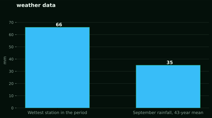
Across eight NuaSense weather stations in Kenya over 13 August to 12 September 2026, station rainfall totals for the month ranged from 0.0 mm to 65.7 mm, a spread between stations that are not co-located and should not be read as one regional figure. Only 58 of 5,370 ten-minute readings across the network carried any rain at all, 1.1 percent of all readings, telling us rain arrived in short, concentrated windows rather than as steady drizzle across the month. That pattern fits the shrub study's ranking of intensity as a major driver of what a canopy or a soil surface actually experiences, but it stops short of being an intensity curve: a single season of ten-minute totals is nowhere near enough data to fit a return period distribution against. The long-run CHIRPS satellite-and-gauge record at the grid cells where our stations sit shows September rainfall averaging 35 mm across 43 years, from a driest year of 5 mm in 1997 to a wettest of 79 mm in 2020, a total-only record with the same limitation: it shows the range of monthly totals a station location has seen, not whether any of those totals arrived gently or violently.
Building your own number instead of borrowing one
No published IDF curve exists for a specific Kenyan farm in any material available here, and none should be manufactured by relabelling a curve built for Addis Ababa, Douala or a New York county. The honest path is the one those researchers took before you: start from whatever rainfall record your station has, which for most farms is a series of ten-minute tip counts, not a daily total. A tipping-bucket gauge already logs the timestamp of every tip, so the raw material for a short-duration intensity estimate exists in the log even when nobody has extracted it yet. The work is to bin those tip timestamps into rolling windows, ten minutes, thirty minutes, one hour, and find the maximum accumulation in each window per storm, over as many seasons as the record allows. A single season, like the one above, gives you the shape of the problem, not a return period. Years of it, the way the NRCC/NYSERDA project used daily precipitation from 157 stations to build partial duration series, is what turns a log of tips into something you can call a curve. This is slower and less satisfying than quoting a number from a paper, but it is the only version of the number that describes your own field. This is also the same honesty problem worked through in the earlier post comparing phone and field rainfall figures: a satellite-derived figure on a phone answers a different question than a gauge standing in your own paddock, and an intensity curve built somewhere else has the same mismatch, just less visible until you go looking for it. Building even one duration bucket, a running one-hour maximum from a single wet season, gives you something no foreign curve can: a number attached to your own soil and your own drains.
Where this breaks: the failure modes worth naming
First is the stationarity assumption every IDF curve rests on: that intensity and frequency of extreme events measured in the past will hold in the future. The Florida IFAS guidance and the underlying warming physics both suggest that assumption is already strained for sub-daily events specifically, and there is still no agreed method for correcting it. Second is treating a disaggregated sub-daily estimate as if it were a measured one; the Addis Ababa, Dar es Salaam and Douala figures are model output layered on daily gauge counts, useful, but not the same category of number as a directly measured ten-minute rate. Third, and the one argued against throughout this piece, is attaching a foreign curve's numbers to a Kenyan location because no local curve exists yet, producing a figure that sounds precise and is attached to nothing real on that ground. Fourth is the artificial floor built into the maths itself, the ten-minute minimum duration used to stop intensity blowing toward infinity as duration shrinks; treating that floor as a physically meaningful threshold rather than an arithmetic guardrail is a subtler version of the same mistake. Last, and hardest to see from a desk, is mistaking a low share of rainy readings, like the 1.1 percent recorded across our own network this past month, for a low-risk month, when KMD's own account of the Indian Ocean Dipole's effect on short rains intensity is a reminder that a quiet-looking total can still hide a small number of intense bursts doing most of the erosive and flooding work. None of these failures gets solved by a bigger dataset alone. They get solved by asking, every time a number is quoted, over what duration, from what record, and disaggregated by whom.
NuaSense has a longer piece on this: Impact of climate change on crop yields in Kenya covers how rising temperatures and erratic rainfall are affecting maize, tea and coffee yields, and how smart farming tools and drought-tolerant seeds are helping farmers respond.
Also drawn on for this piece: NY Projected IDF Curves.